Designing the Whole Site
Plan the unifying
themes and structures
Create smooth transitions
Use a grid to provide visual structure
Use active white space
Avoid random, jarring changes in format
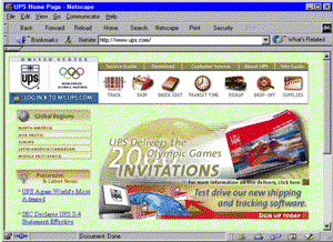
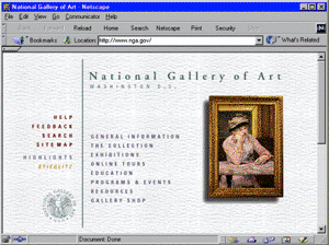
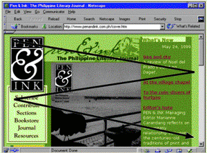
Reinforce the identifying elements
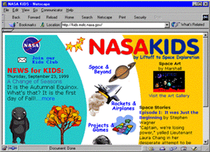
Unifying theme and structure for children

Unifying theme and structure form opening page to secondary page
Focusing on White Space
Use
white space deliberately in your design
Good use of white space guides the reader and defines the areas of your
page
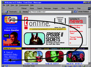
Active white space is an integral part of your design that structures
and separates content
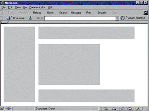
Active vs. passive white space
 ......
Passive white space ....................................................... Active white space
Designing for the User
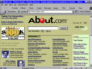
Keep your
design efforts centered solely around your user
Design for interaction
Design for location
Guide the user’s eye
Decide whether the user will read or scan
 ......
Design centered on end user .....................................
Design centered on end user
 ......
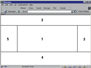
Areas of screen importance
Paper-based reading pattern ................................. Screen-based reading pattern
Restricting the Amount of Information
Be considerate of your users and don’t overload
the page with unnecessary information
Provide enough clues to allow them to find the information they want
Use links to divide content between pages
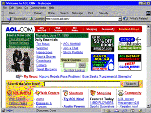
Clues to allow user to find the information and
links to divide content between pages
Designing for the Screen
The computer
display is very different from print-based media
The display is landscape-oriented
Colors and contrasts are different
Computer displays are low-resolution devices
Reformat paper documents for online display
Hard-to-read links
 .......
Text formatted for paper ........................................... Text formatted for the screen
Summary
Craft a look and feel and stick with it throughout
your site.
Design a unified look for your site.
Use white space actively as an integral part of your design.
Use text, color, and object placement to guide the user’s eye.
Plan for easy access to your information.
Don’t let the user click through more than two or three pages before
they get what they want.
This information was taken from the Powerpoint presentation unit_B from the Instructor’s Manual to the textbook Designing Web Sites - Illustrated Introductory